Spring months are for sunshine, fresh fruit, and brilliant colors. After the cozy winter months with thick layer sand earthy hues, spring brings a readiness to get outside and embrace the energy of a world popping back up with the color of life.
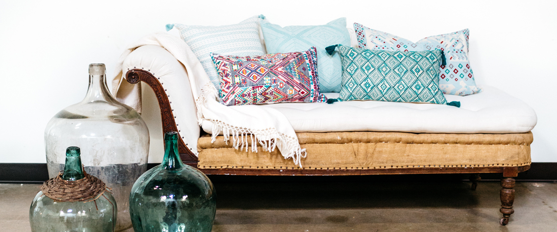
This season, we drew inspiration from the colors found in the markets we wander. Vibrant red, pinks, greens, and blue mixed with calming, classic neutrals. If you know me well you know I’m a little afraid of color. It energizes me as I walk through the marketplaces of Latin America but as soon as I get home I just can’t set that bright piece in the right place. It feels too intense and ashy. I’m always running from one thing to the next and so I want my home to be a comforting, relaxing place. But the weavers we work with make such beautiful color so I challenged myself: How can we blend the colors they love so much with the neutrals I tend to gravitate toward?
Pastels. Also usually a little scary to me. A little too sleepy and baby-ish. But blend the two and you get a vivid shades grounded in soft hues – and I’m in love. Light grey tones down pink, serenity blue (one of Pantone’s favorites currently) tames red, purple is grounded by indigo. Back it with ivory and we have energy that isn’t overpowering. We have energy that adds life and that pop that reminds you to get outside, in the sunshine, and on the water (preferably with a margarita in hand).